Freddie's Flowers Rebrand
Intro
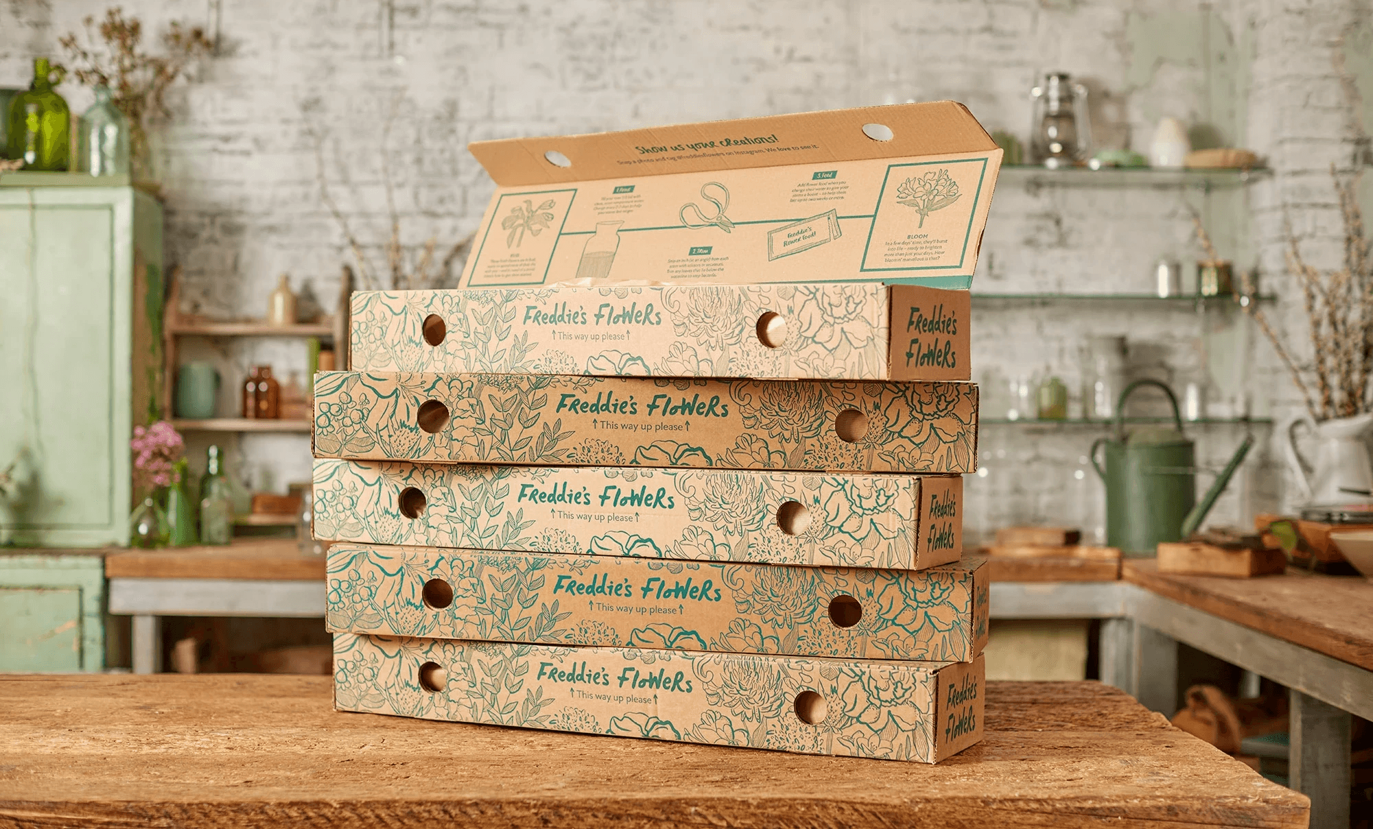
Freddie's needed a brand identity that was more elevated to suit its premium product. Working from an agency-led strategic direction, I defined the graphic language – including a new illustration style and a seasonal colour system, and developed it across the full brand, building a flexible approach that let the brand stay fresh year-round without constant redesign.
Deliverables:
Branding
Brand Strategy
Brand Systems
Art Direction
Illustration
Email Design
Print Design
Retouching
Outdoor Advertising
Packaging


Previously there was a mix of illustration styles, a naive, childlike look for the branded illustrations, and more technically accurate illustrations used for diagrams. With the rebrand I wanted to have one coherent style which would suit the premium, elevated feel we were going for, and be accurate enough to use for the weekly arranging guides. I also developed a seasonal colour palette that could be used to show progression through the year, which would complement the flowers and photography. Each colour is taken from key flowers used at different times of year.

The arranging guides are the backbone of Freddie's Flowers. These guides go out with every flower delivery, tailored to that arrangement, with hints and tips about the flowers customers receive. There are four arrangements a month, in three sizes, plus occasional special arrangements throughout the year – all in English and German which equals between 24-28 guides a month. I simplified what had been a complicated process, introducing new workflows and timelines, and I redesigned the guides into a template to ensure a smooth and efficient process from start to finish. Due to the nature of working with a live product, there were often last minute changes, and the new system and design enabled us to take in changes promptly and efficiently.


Our first ever Mother's Day campaign launched with the rebrand, across paid social, email, DM and outdoor advertising. Wanting to keep the appeal broad, we focussed on all loving relationships and not just those with a mother, using different taglines signifying the relationship.


The Peony campaign shows an example of how the branding evolves throughout the year, using key seasonal colours.

